How to decide the color palette for your home?
The ambiance of a dynamic space helps connect with the users, where color plays a crucial role in significantly influencing the user’s productivity. Colors and architecture are interdependent characteristics that merge to form an enhanced space for every user. They help to create themes for users to express their emotions better and inculcate warmth, calmness, and tranquility. Apart from architectural elements, a unique home color palette changes how one adapts to the space.
Finding the right palette
Like architecture design, the color scheme plays with human psychology. It subconsciously affects the mood and evokes feelings of comfort and excitement. With different users, the role of different colors changes. One can find it exciting, while others can find it dull. Similarly, with distinct functions, the applications of colors change to adapt to human behavior. For example, social spaces require warm tones to elevate interactions, while offices and hospitals need cooler tones to bring calmness. Therefore, the color scheme should be applied thoughtfully to fulfill the needs more accurately. Let us understand the color psychology that transforms the architectural design:
Golden Ratio of Colors
A balanced and a perfect ratio instantly elevates a home and makes it visually pleasing. With home interior design, a color palette can be developed that includes no more than three colors. The three colors to be used are a primary color, a secondary color, and an accent color in a proportion of 60:30:10. The primary color becomes the larger element of a room, and the secondary colors are applicable for furniture pieces that blend with the primary. Lastly, the accent colors add to the vibrancy and make a statement. The proportion can create a balanced space to promote rejuvenation for a human being.
Proportions of shades of blue with beige © asianpaints.com
Macro or Micro
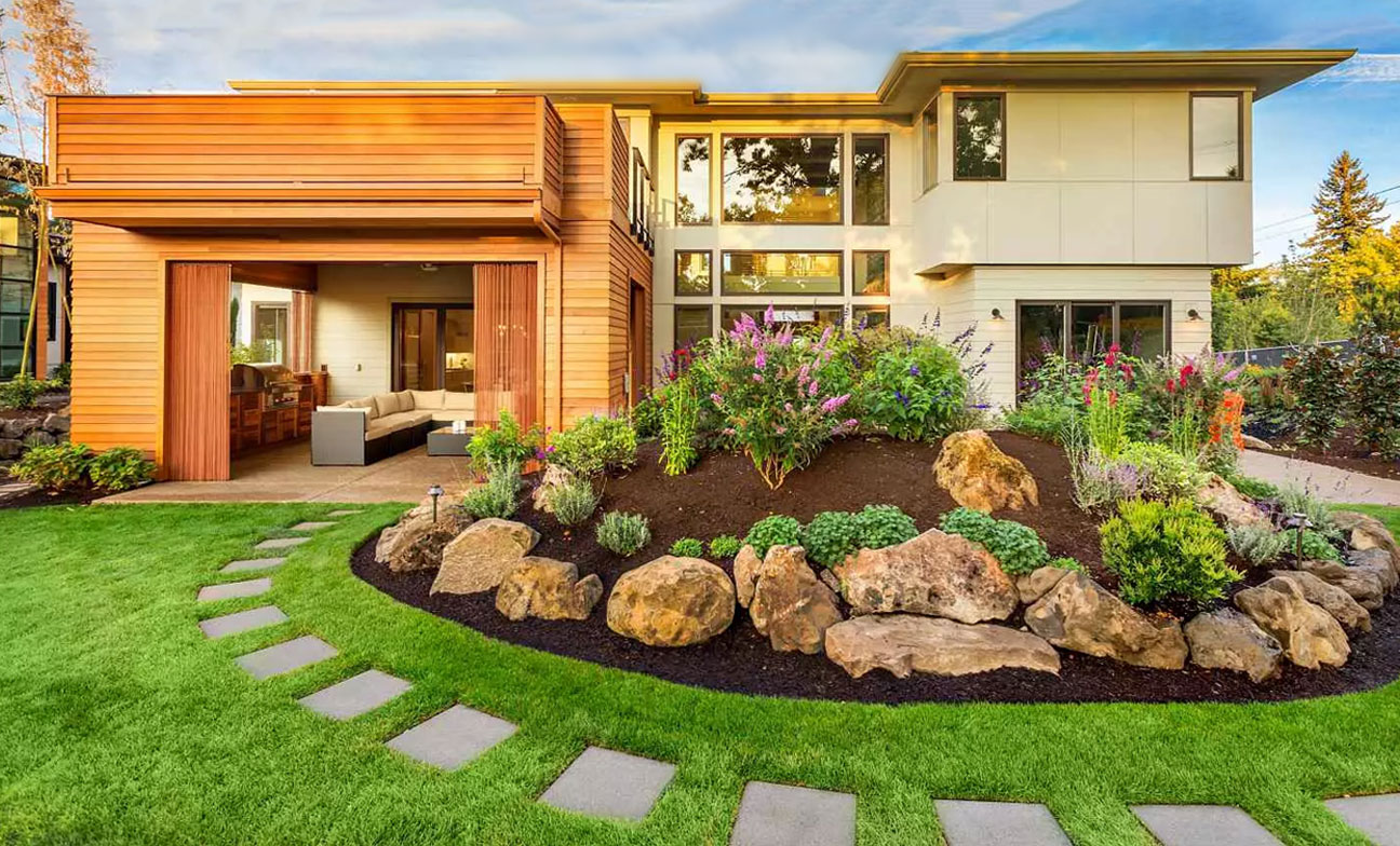
It is important to understand, the color theory in context to how one perceives a space. Depending on the user, the space can be expressed as huge (Macro) with a lighter use of color palettes, whereas, on the other hand, it can perceived as tiny (micro) with little darker shades. The lighter colors such as pastels, can be applicable in public spaces like living rooms or dining areas. The darker color palette such as navy and dark green, can incorporated in dens and bedrooms where one needs to feel cozy and safe.

The essence of spacious room © pexels.com
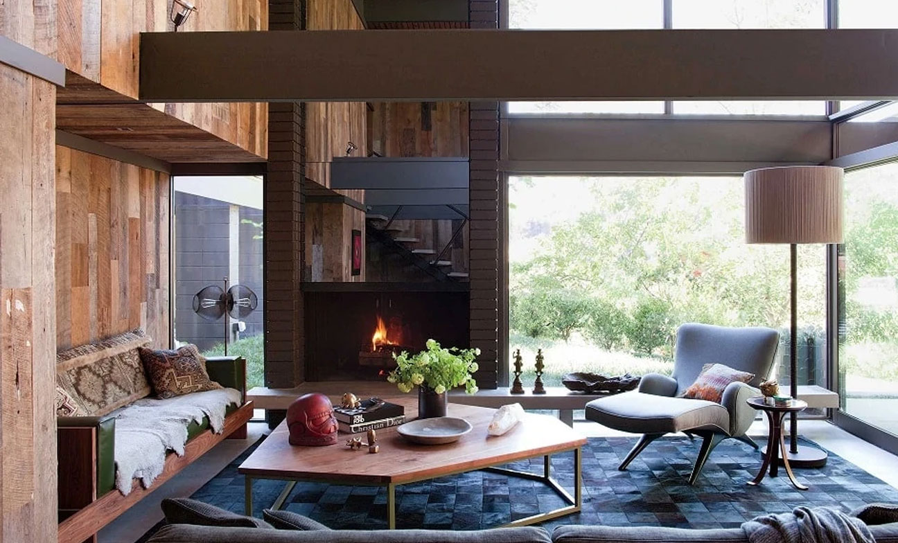
With respect to light and materials
The addition of depth and texture with color helps in creating dynamic spaces. It allows the natural light to play with the shades of color and materials and assists in transforming the space into a serene environment. Eventually, with the interaction of light and materials with the home color scheme, one can psychologically heal with the warmness and calmness of the space.

Grey and natural colors interacting with natural light © pexels.com
Functionality
Functionality is one of the significant elements that help in creating a home color palette. Each room in a home holds its own identity, thus the colors used should contribute to the room’s usefulness. For example, one can have the same base colors or primary colors in every room and develop unique shades of secondary and accent colors for each. This helps in creating an independent palette for each space while making sure it is a cohesive space.
Color themes based on functionality
Colors being a primary aspect of a room, it is important to understand the functionality and decide the theme of the room accordingly. Like lighting, the colors change the aesthetics of a room thus one should understand the functions of each room in a home interior design:
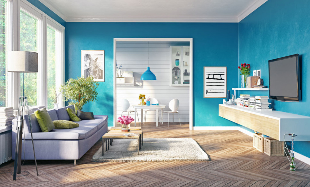
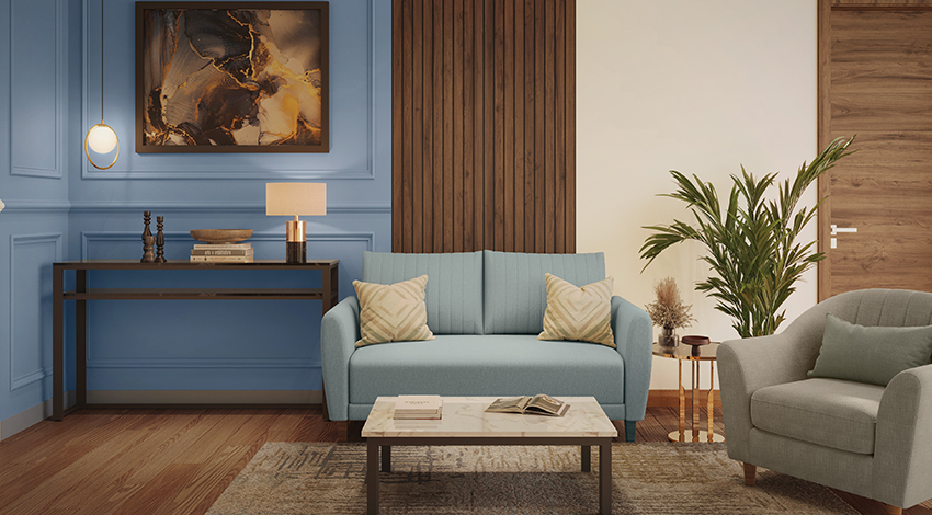
Living room and dining
With rooms that represent socializing and the family coming together, it must look spacious, and lighter to the eyes of the users. Therefore, application of warmer and earthy tones like beige and pastel greens in the living room color palette makes the room spacious while playing with the natural light. Natural greens add to the earthiness that brings a sense of comfort and helps promote socialization.

Warmer and Earthy living room © pixabay
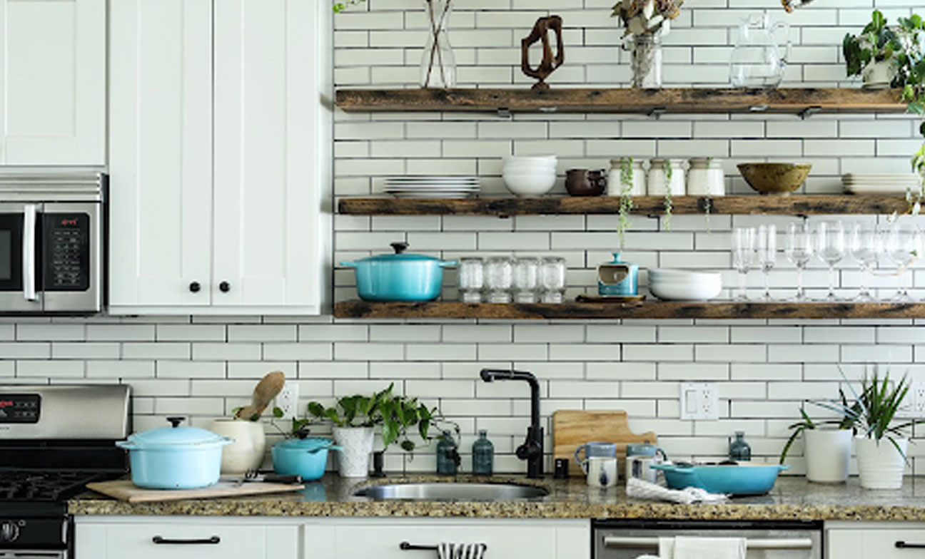
Kitchen
Unlike the living room, the kitchen is an active space where one incorporate colors that revives energy. It should have a color palette that intermediates between the lighter and darker shades that can help achieve minimal maintenance. Additionally, it offers a fresh look with a lively atmosphere and looks organized. The color palettes that can applied are muted shades of red, teal, and pastel blues that express chic and classic.
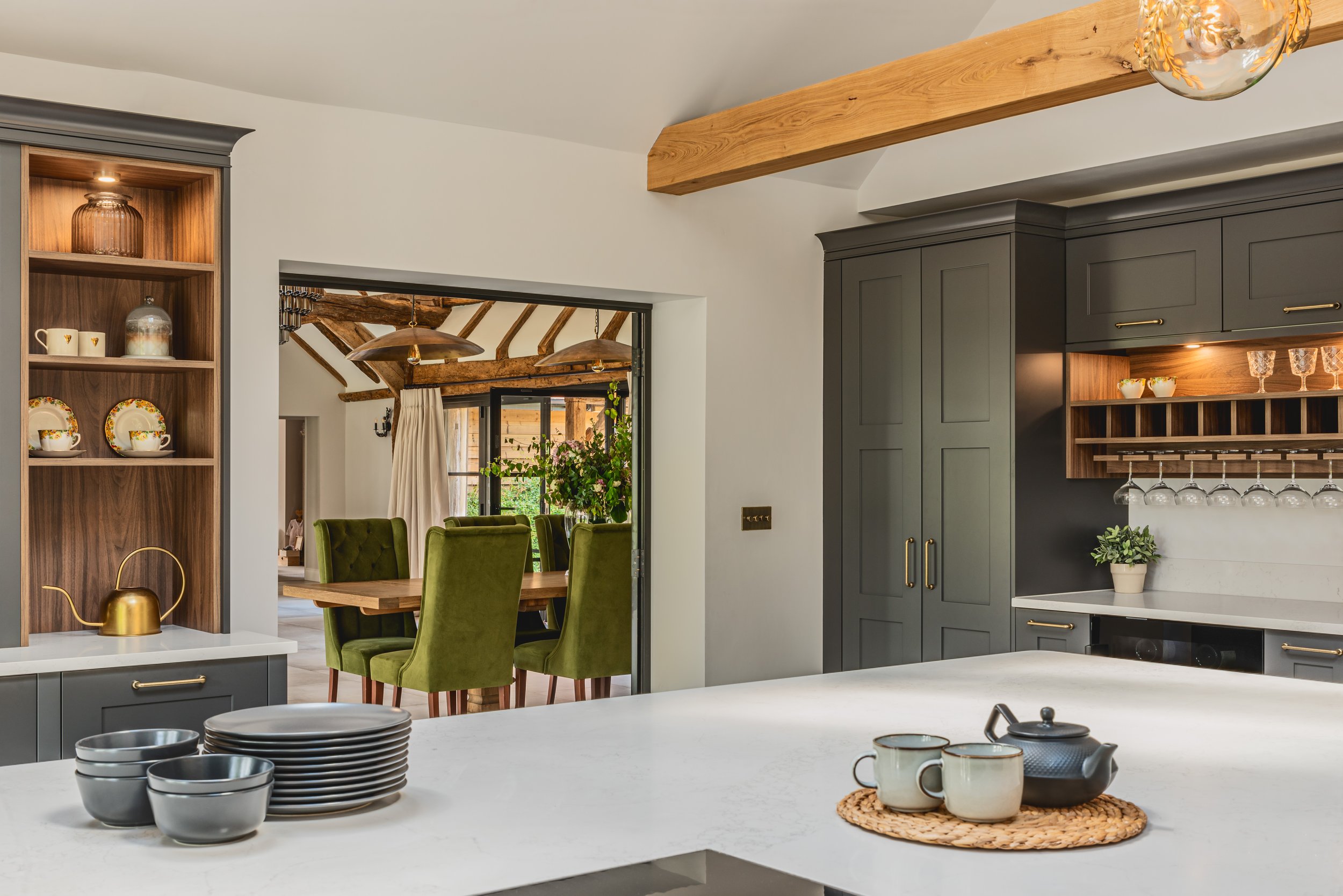
Natural green Kitchen design with warmer secondary tones © squarespace.com
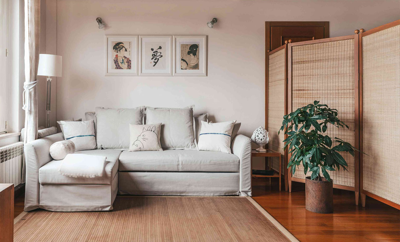
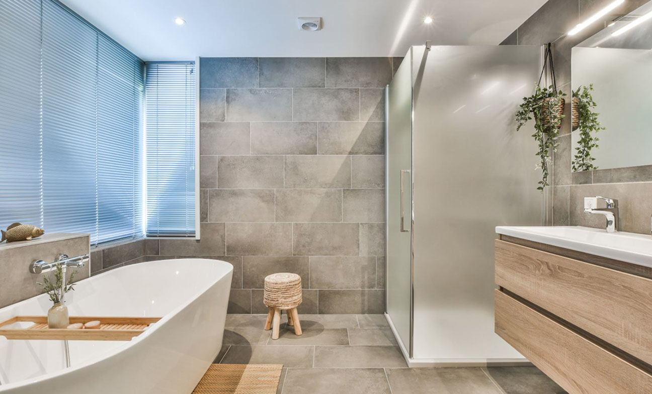
Bedroom and Bathroom
Bathrooms and Bedrooms are more of a private space where one wants to stay in their bubble. Thus, opting for cooler tones like blues or pastels greys can help in relaxing, and darker accent colors can represent a sense of coziness. Additionally, blues for bedroom colors can also help in reducing strain and enhance the sleeping schedule.

A cozy and warm bedroom © istockphoto.com
Conclusion
While too many colors in a home can make it chaotic, fewer colors can make it monotonous. The right palette that balances the colors and the architectural elements in a space articulates every space uniquely. It integrates natural colors with consideration of natural light, easy transition between spaces, textures of accessories, and functionality. It puts forward a cohesive home color scheme ensuring the characteristics of dynamic and harmony prevail. Every room keeps its individuality while expressing the concept of oneness when put together and making a unique home design style.

About Pragya Sharma
Architectural WriterPragya is an architectural writer and content strategist. Her writings are industry-relevant and easy to understand. With 4+ years of experience, she has created content across various platforms in the format of blogs, social media content, and newsletters.